OBJECTIVE
Each will reflect energy, a mix of cultures, and provide opportunities to support farmers, fisherman, and their smaller culinary businesses. Must bring connection between locals and travelers, growth, and to build unforgettable experiences. Spread the awareness of environmental sustainability, socio-cultural awareness, and the human capacity for change. The main target audience are travelling millennials, chefs, and local businesses in South Africa.
SOLUTION
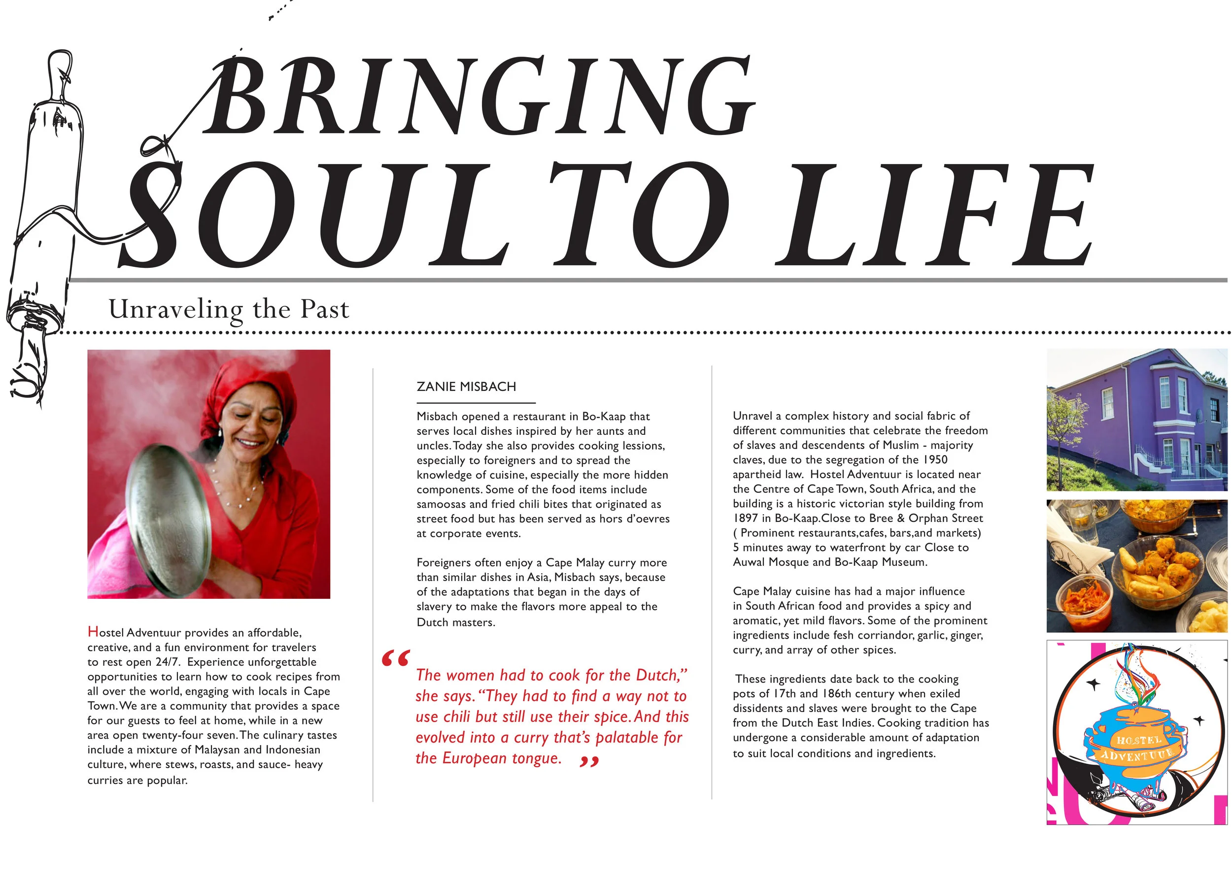
The design elements will include vibrant colors and hand drawn elements of cooking illustrations. Includes logo and brand identity strategies including three flyers to promote a special cooking event.
The typeface is a sans serif to promote the young, energetic elements. Vibrant colors inspired by the architecture in Bo-kaap is utilized in order to reflect historical context. The design system includes a logo that is minimalist and limited to one hue, in order to create a strong, clear symbol of recognition. The illustration component for the brochure will reflect a “Melting Pot” with a variety of hues to reflect. The brochure however, explores culinary tradition and historical influence with Zanie Misbach.